


LAIKA is an airline that focuses on travelling with pets that has been created to meet the current need of travellers who want to fly with their pets without having to worry about their pets having to travel in the hold. The brand is positioned as a company that takes care of the travelling conditions for animals and that works to offer a quality, comfortable and practical flight for the user, who can have their pet with them on a seat. It is important to point out that it is a positioning that is far removed from the low-cost option.
The area of travelling with pets is a niche market among airlines that has many shortfalls that need answering. This is why an airline needs to be created exclusively for travellers with pets.
The aim of the project is to design the identity of this airline that focuses on travelling with pets. The aim of this identity is to distil and communicate graphically the identity values of the company and its new travel idea, which promotes an improvement to conditions for animals and their inclusion in the cabin. It is an airline that has been created for anyone who wants to travel the world along with their best friend, their pet, a value that takes it beyond conventional airlines.
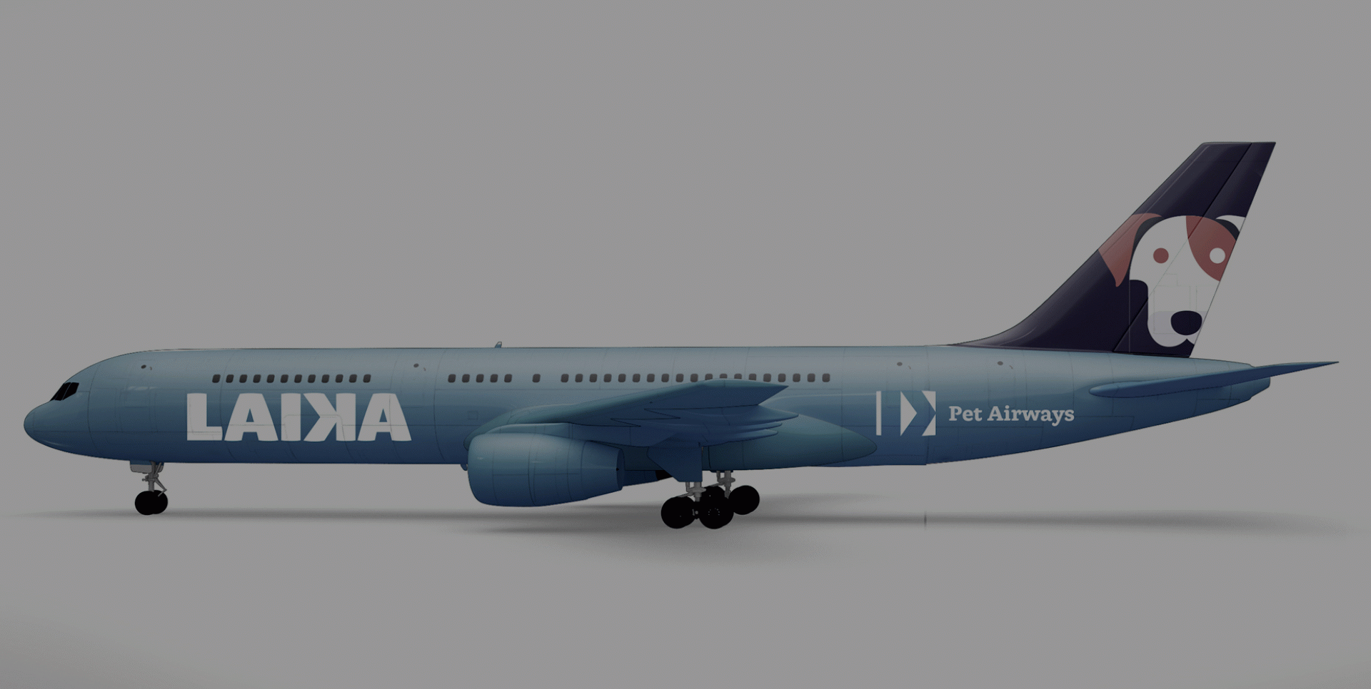
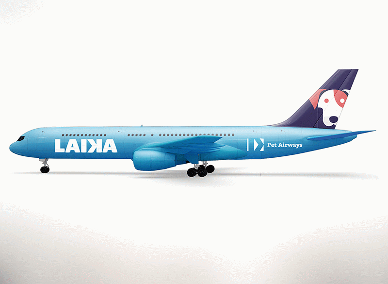
To carry out this project, it is proposed to create a visual system following the idea of unique, “star” flight for pets. Hence the chosen name of LAIKA.
A Russian dog, Laika was the first living being to orbit the Earth. She was launched experimentally in a spacecraft and was dead when she returned. At that time of new space exploration, the propaganda posters showed the explorers as heroes, through their pose, in close-up... This has been used as the reference to develop the graphic identity. From this basic idea, the concept has been retained of exclusivity, of keeping the animals as the stars, and of exploration, but in this case, of a new way of travelling. Therefore, the identity for the airline opts for a strategy that focuses on working on the idea of space travel in tandem with air travel.
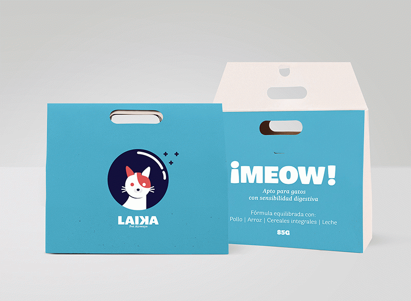
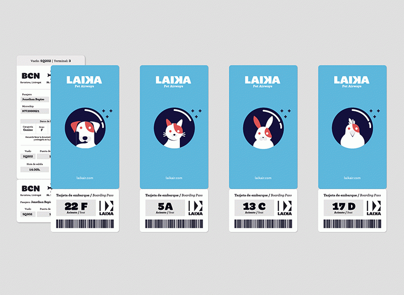
The main colour that will predominate in the brand is light blue to represent the sky, together with dark blue to represent space and red as a colour to give a touch of light to the graphics. As a complement and for the small details, a lighter tone of blue and a grey at 15% will be used.
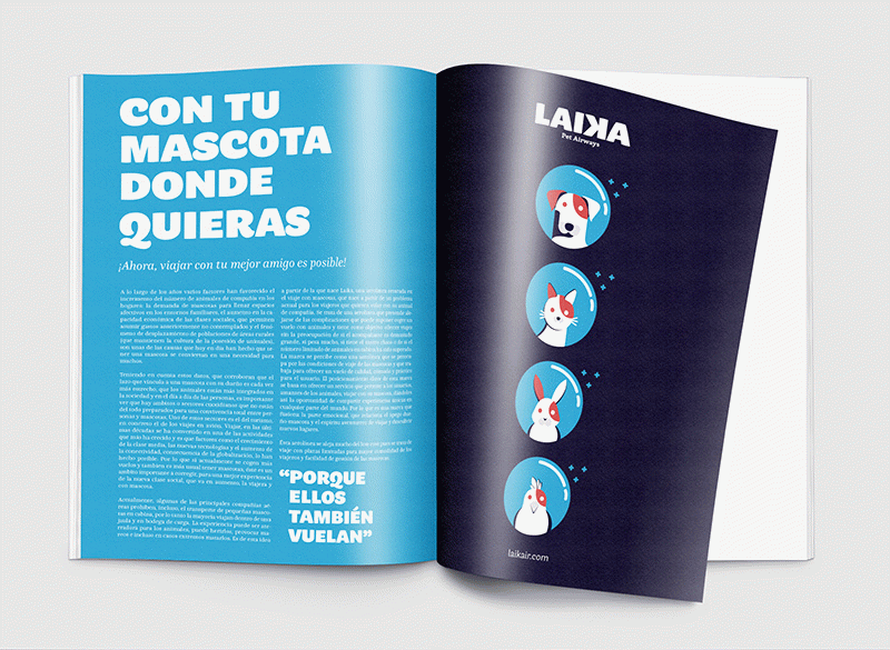
The animals that travel on board play an important part in the brand identity, as they are the ones that will guide the style to follow and the main face the user will relate to and how they will identify the airline. As the intention is to convey the idea of unique, stellar travel in which pets are the stars, they have been portrayed as astronauts, with the usual space helmet. The intention is to communicate the brand, with simple figures and plain colours, at the same time with a friendly, approachable and cosy tone. A strong point of these icons is that, due to the simplicity of the shapes, versions can be made that work in one ink, positive or negative. These categories of animals are not random but reflect the percentages of the different pets. As a result, we have dogs in first place, followed by cats, rodents and birds.
 Laika, Pet Airways
 Laika, Pet Airways
 Laika, Pet Airways
 Laika, Pet Airways
 Laika, Pet Airways