


Fahrenheit450 is an independent publishers aimed at poetry.
The publisher comprises professionals from the different fields needed for a book launch: cultural managers, graphic designers, philologists, poets and readings and reading clubs schedulers in Palma de Mallorca and Barcelona.
The focus of the project is the use of and respect for paper in book publishing, as well as painstaking content design in all the variants of publishing.
The pieces developed adapt to the demands of the medium and environment of poetry to differentiate them from the current proposals and the consequences of the digital age in publishing.
The aim of the Final Degree Project is to develop naming, a brand, a design and layout of the publisher’s books, to design a collection and create a fanzine as a promotional piece.
During the process, a study was conducted into the possibilities of producing the book and the challenge in designing poetry, which means the apparent non-intervention of graphic design but which shares synthesis as an essential basis and needs adapting to publishing ortho-typography and layout parameters.
As well as the media defended by the publishers, with paper as the main element, we had to communicate our project through digital media: from adapting the brand to distributing the material produced.
Fahrenheit 451 is a dystopian novel by American writer Ray Bradbury published in 1953. The title refers to the temperature on the Fahrenheit scale at which paper in books catches fire and burns.
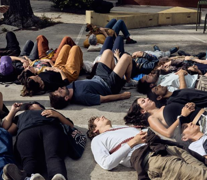
The publisher took the name Fahrenheit450 in reference to the final degree of survival of reading, that instant just before the book disappears. Fahrenheit450 aims to be at the limit of the end, close to the fire and poetry and reminding us of our commitment to publishing in the face of threats to culture and paper.
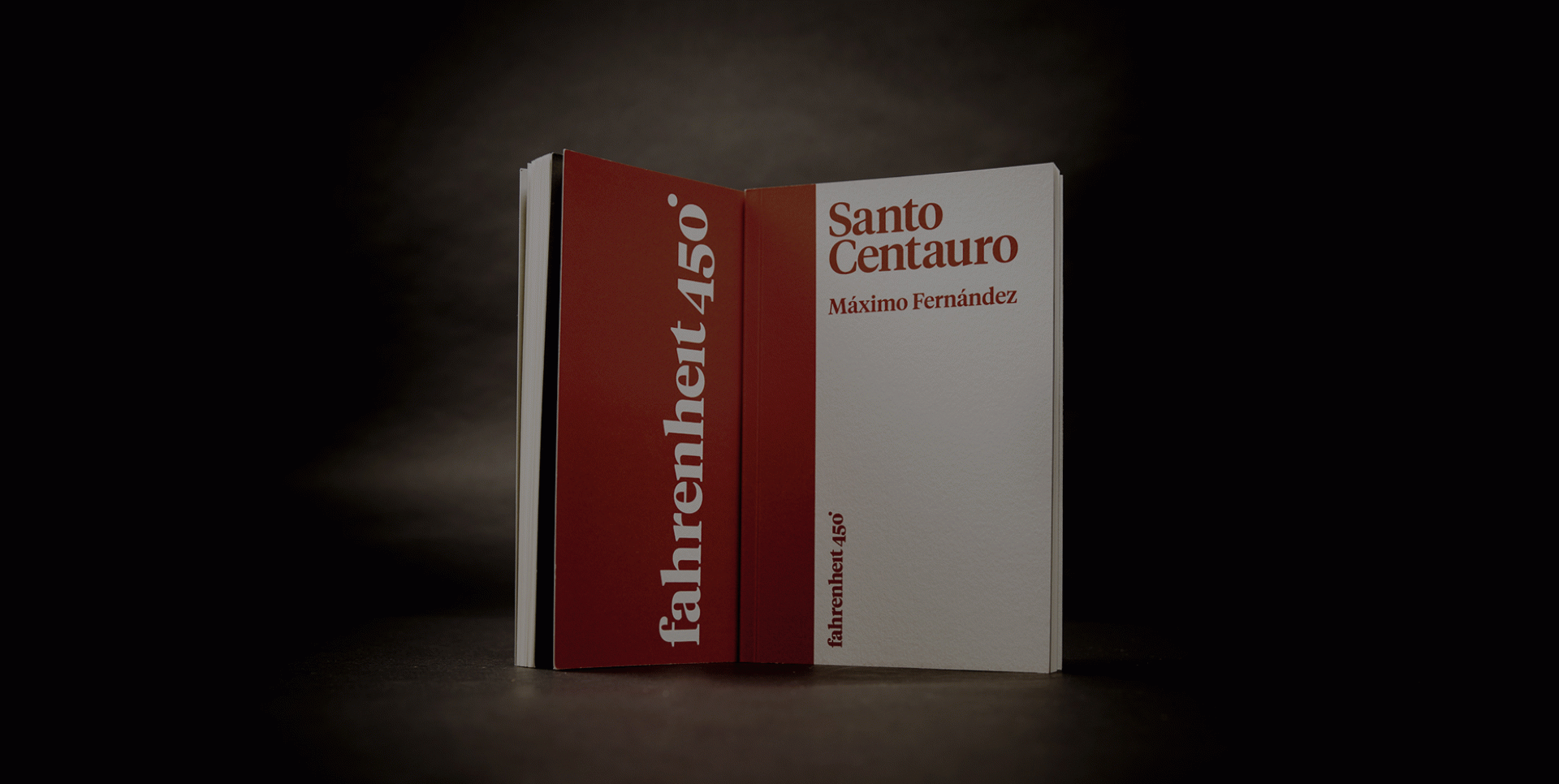
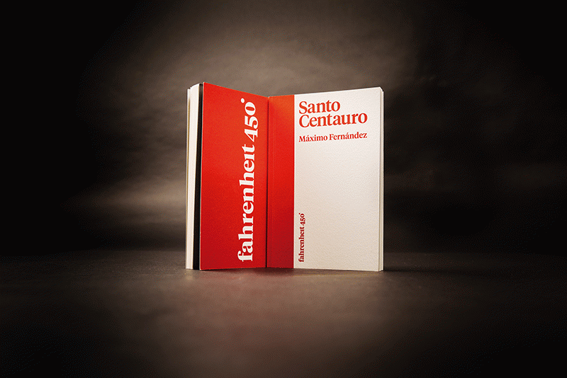
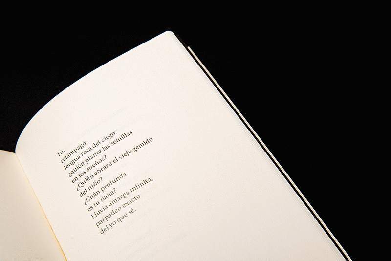
The paper chosen, the printing system and, in short, the finish should have an artisan look to them. We need to find ivory paper known for its porosity. Some detailed collections show photographs and sketches on their covers. However, the aim of our project is purity and to speak volumes with little iconic intervention.
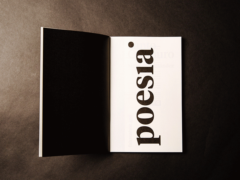
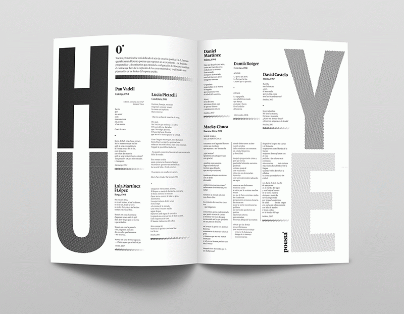
The danger paper faces in the technological age, the care and defence of culture, the intensity of poetry and reading as a transformational action are the conceptual bases that mark the publisher’s colour line, based on shading. In poetry, readers are considered to no longer be equals faced with great verse. For their part, poets are not the same after they have written a collection of poems. Poetry has the power to reveal a great truth that uncovers something different within us. This internal journey, or change of state, is more intense in poetry than in other genres. The graphic translation of this transformation is realised through two-tone silk-screen printing shading.
 fahrenheit450
 fahrenheit450
 fahrenheit450
 fahrenheit450