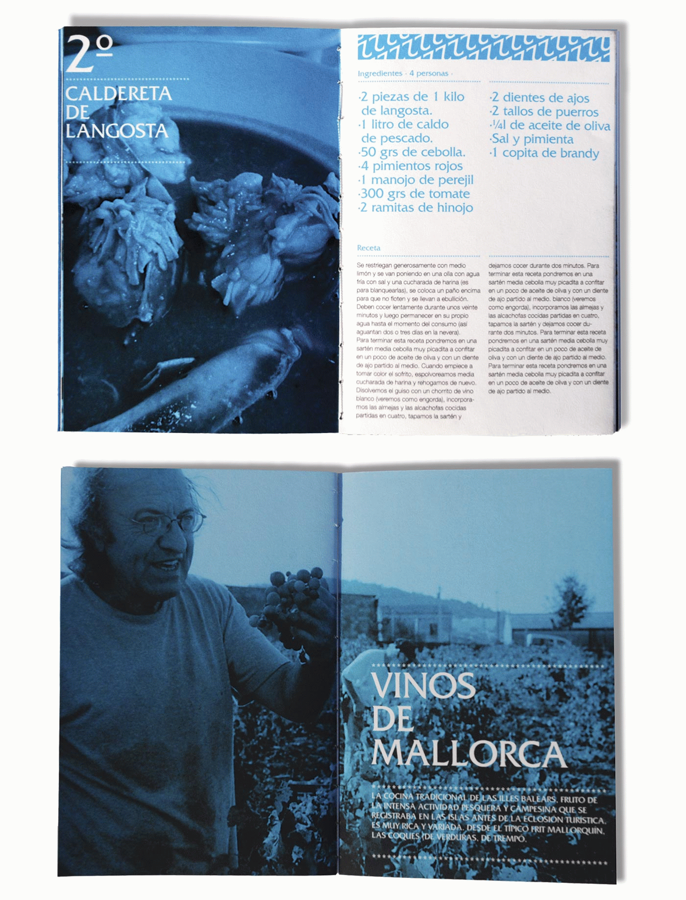

The main aim of this project is to promote traditional Spanish cuisine to educate the public in food and to encourage people to try cooking traditional food at home.
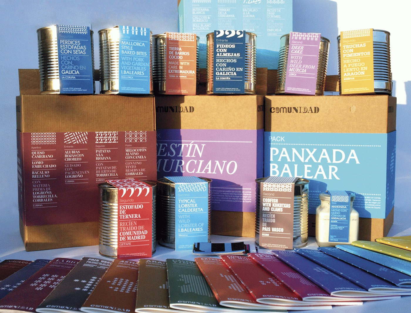
To achieve this, the graphic identity has been created of a traditional Spanish quality ready meal business, organised by autonomous communities, and a selection has been made of the most representative products and of the traditional recipes from each community.
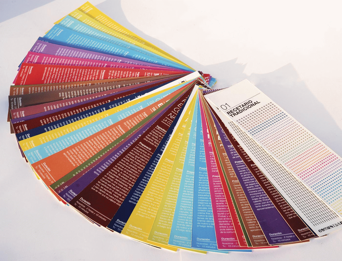
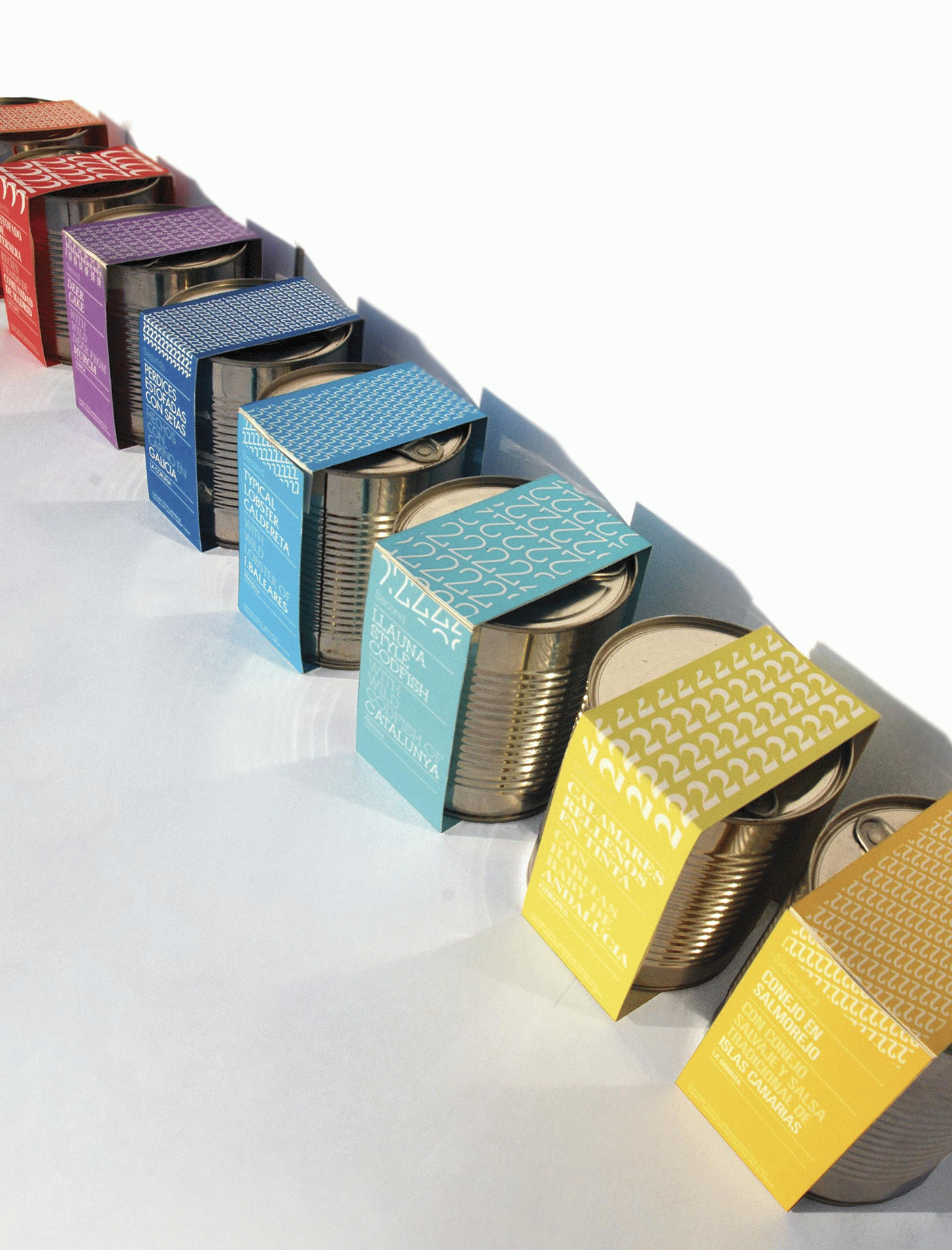
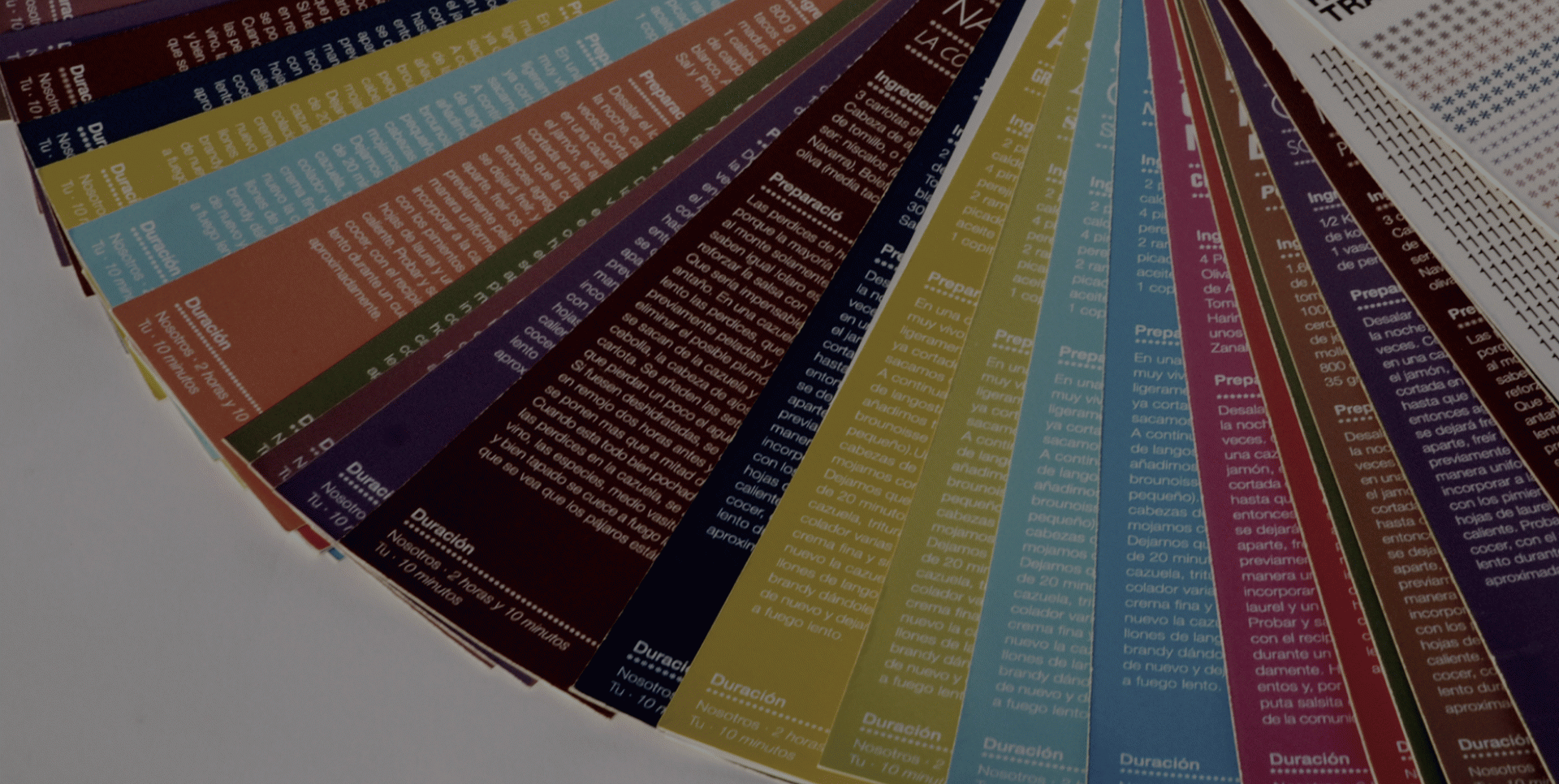
The communication challenge is to reinterpret the concept of traditional Spanish cuisine, getting away from clichés, creating a very clear graphic system, as we need to differentiate the products by community, by dish and by recipe. Visually, the aim is to create unity while maintaining the personality of each community. In short, the project is based on a very good hierarchising of the information and creating an organised mess.
To solve this, a typographic system has been created based on eclecticism, in which each community has its own typeface, a colour code that goes from light to dark following the direction of north to south and a numerical system of connections to differentiate the various dishes.