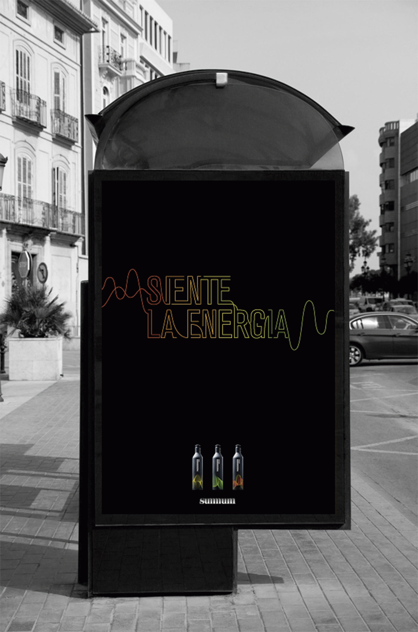

Energy is the key
Summum is much more than a brand of energy products, it's a different way of understanding them. It is a product focus that seeks to ensure that users feel that they are different, like the product they are buying.
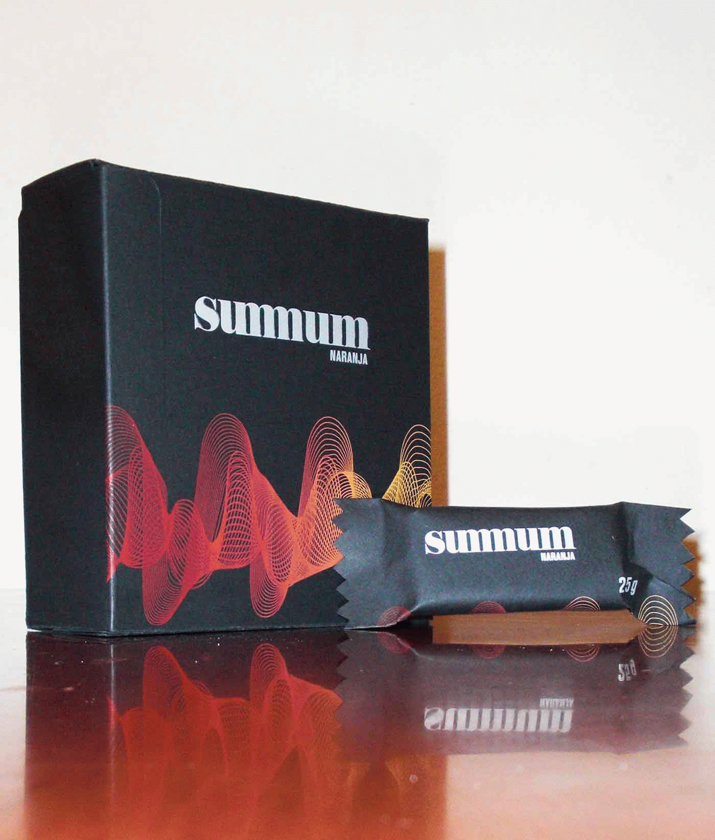
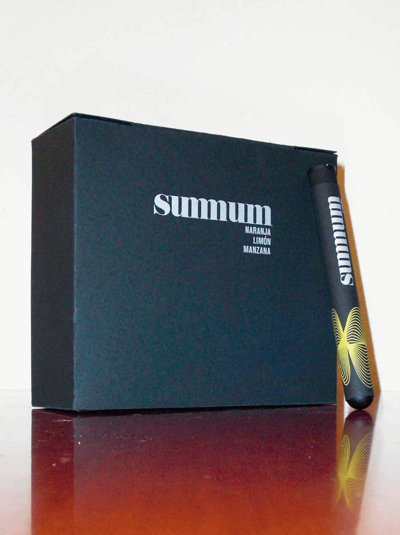
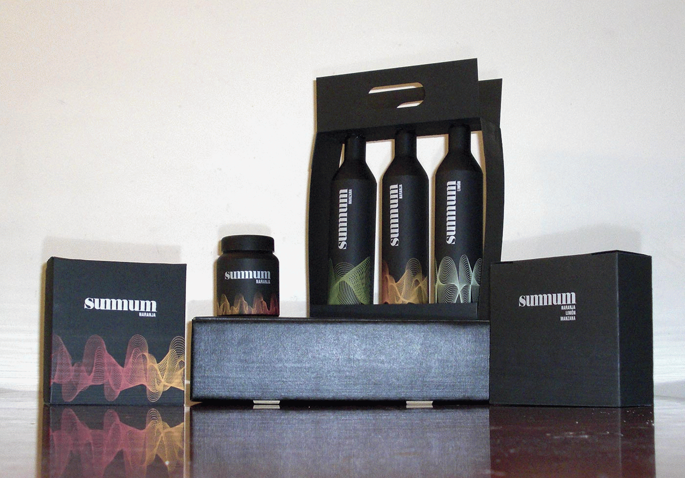
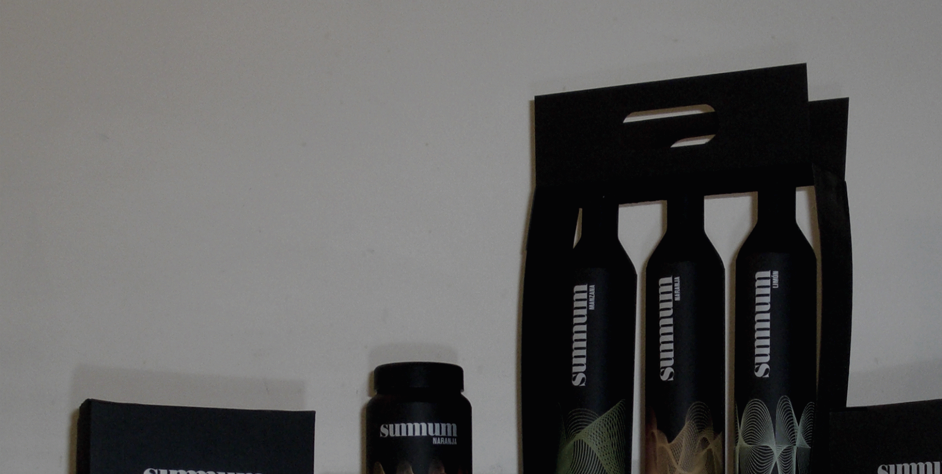
Summum has graphics that move away from that of its competitors, both in the use of various graphic resources and in the use of a typography never seen before in this field. It is seeking discretion.
The graphics of the mock-ups have been done in silk-screen printing. The base paper is black and the symbol is applied to it with silver ink. The various degrees of the energy drink are differentiated thanks to the image of a wave. This is shown in shading while the rest of the information is displayed in white. The result is a fairly subdued graphic image.
Silence marks the difference. In a world where everyone wants to be noticed, Summum stands out for its elegance and its restraint.