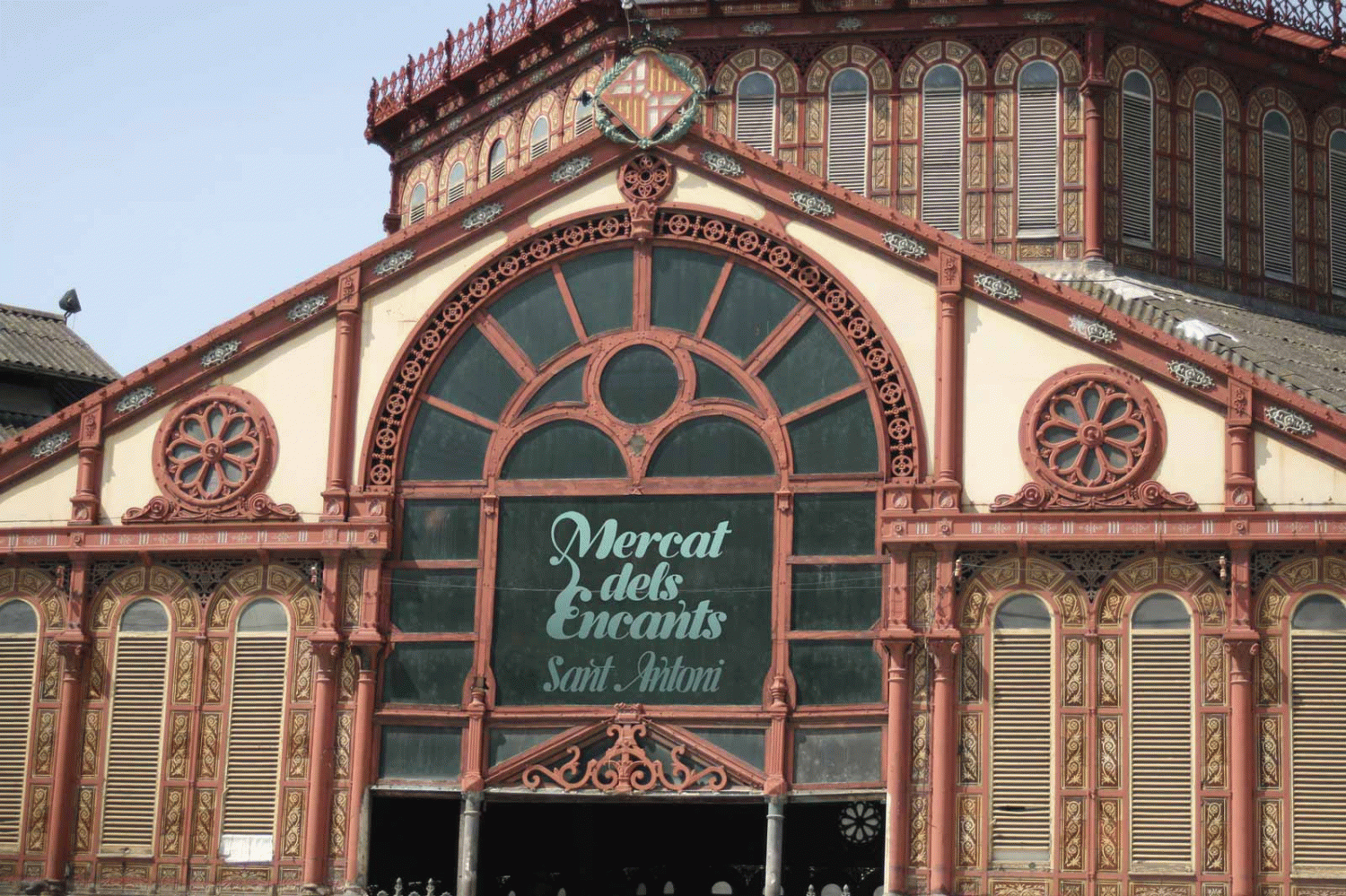

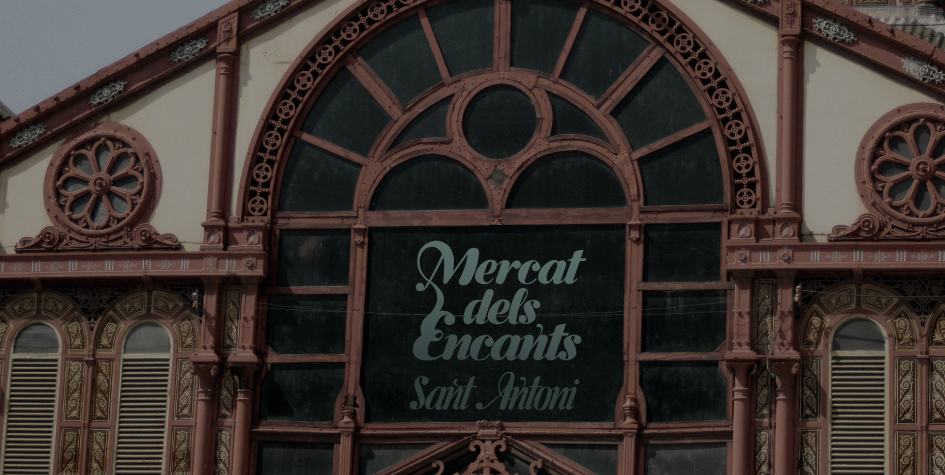
The creation of a typography for the Encants del Mercat de Sant Antoni de Barcelona. This market is renowned for its spontaneous and chaotic organisation, for its hazardous passageways that make it difficult to get your bearings if you are not a regular customer. The aim was, therefore, to find a typography that would adapt to this identity: to-hand, everyday, friendly, life-long; and which at the same time would not destroy the heterogeneity of the market and its incredible wealth of products.
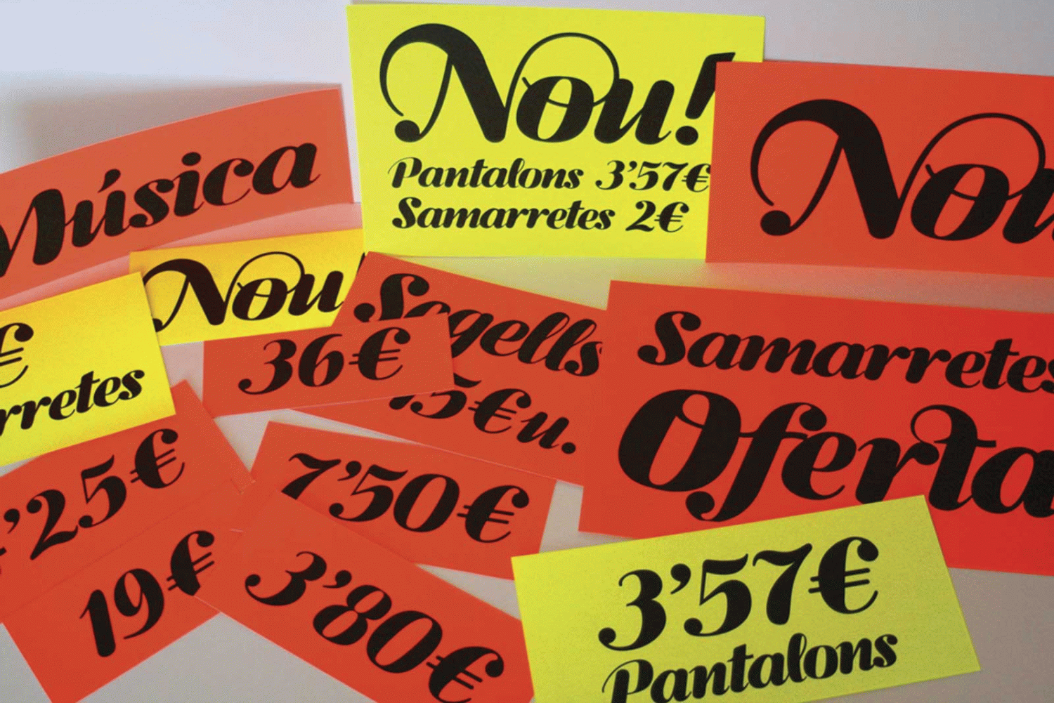
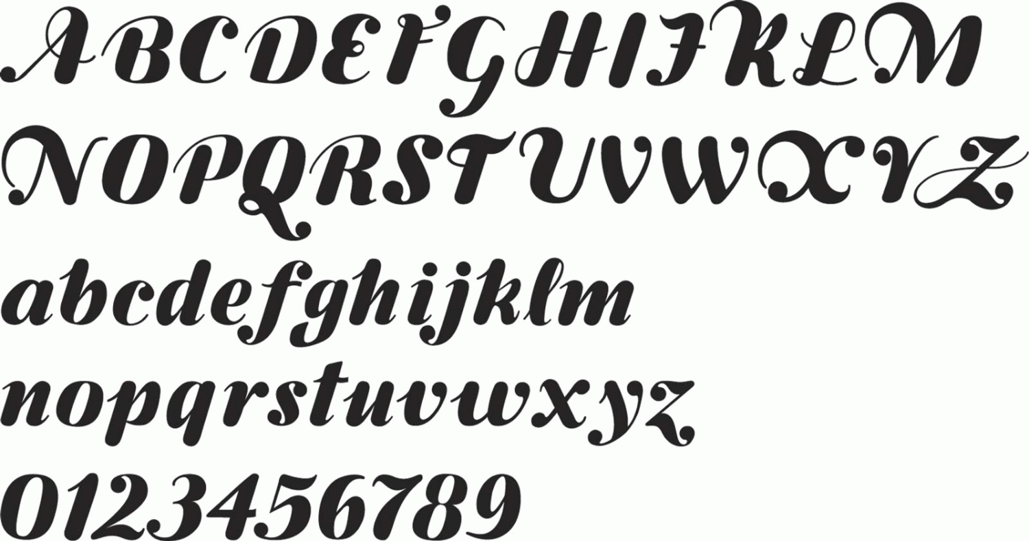
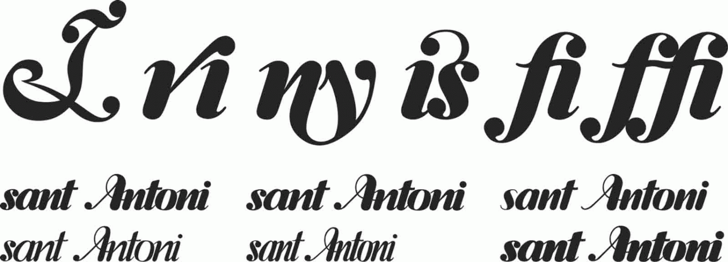
The challenge is to make a corporate typography compatible and not distance it from this heterogeneity. The response to this initial requirement is to create a typography that allows for a varied and variable composition to avoid rationalisation and uniformity. Consequently, every word, every letter and every composition had to be different, but at the same time integrated as one. A display italics typography with highly contrasting thicknesses and in a calligraphic style that means that it can be read quickly and brings the form closer to the image of Els Encants.