


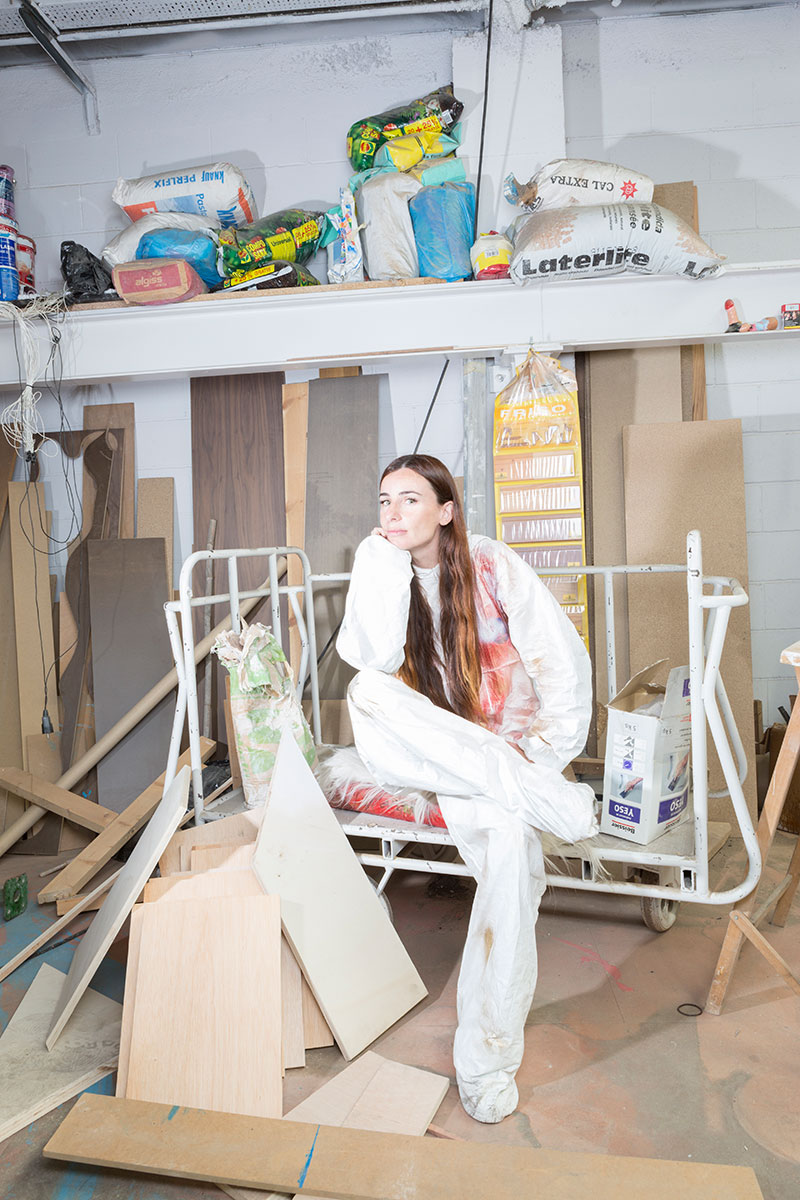
Raquel Quevedo, EINA ex student, heads her own studio for graphic design, art direction, sculpture and installation art. Melding experimentation and imagination, her work is characterized by her search for new creative paths through physical-virtual disconnection in processes and forms.
Raquel Quevedo, EINA ex student, heads her own studio for graphic design, art direction, sculpture and installation art. Melding experimentation and imagination, her work is characterized by her search for new creative paths through physical-virtual disconnection in processes and forms.
How has your vision of design evolved since university? When you founded your studio, did you have a clear idea of the kinds of projects you wanted to develop?
I understood design as a border of sorts, and now this border opens and closes, like a circle that no longer exists. Everything is part of the same story, different paths in the labyrinth, a Bio-Graphy. When I founded my studio (in 2010), I wanted to focus on procedural and method-based experimentation, as well as on creating typography… and that’s more or less what I’ve done, but now it’s all much looser, mixing design, photography, painting, art, sculpture, literature…there isn’t even a “physical” location for the studio: it varies according to the project. I have gone from experimentation as a physical perceptual error to physical-virtual disconnection as a possibility for new creative paths.
In your sculptures, it seems as though the process is as important as the final result. Do you follow the same methodology with your typography work? How have your studies at EINA influenced them?
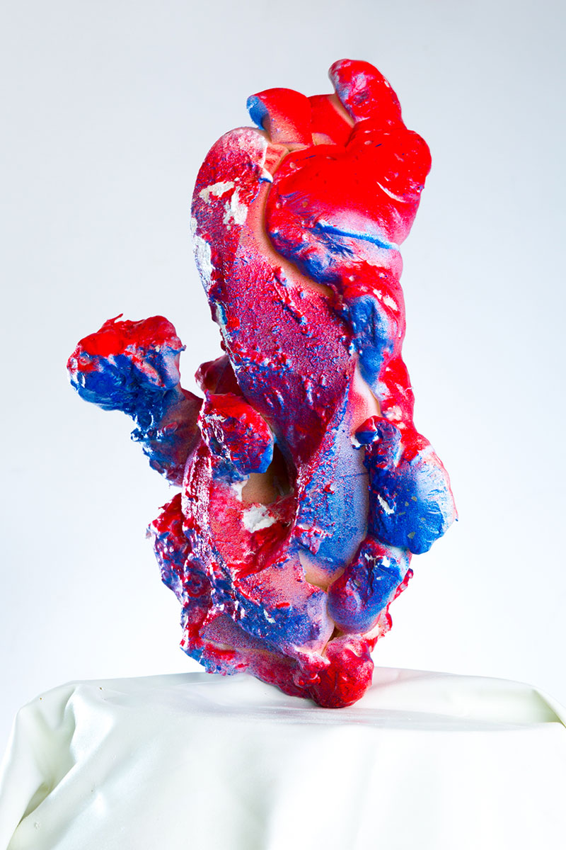
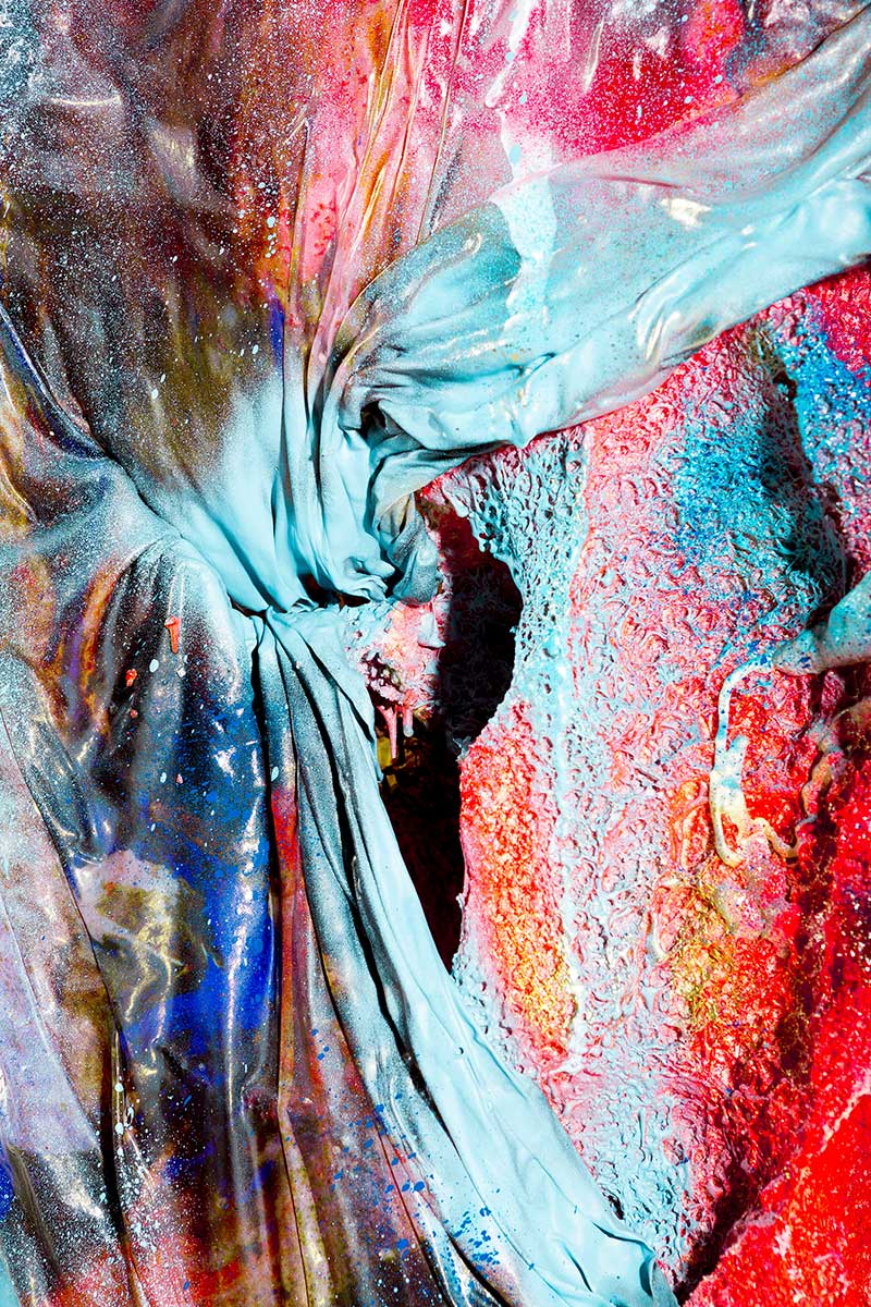
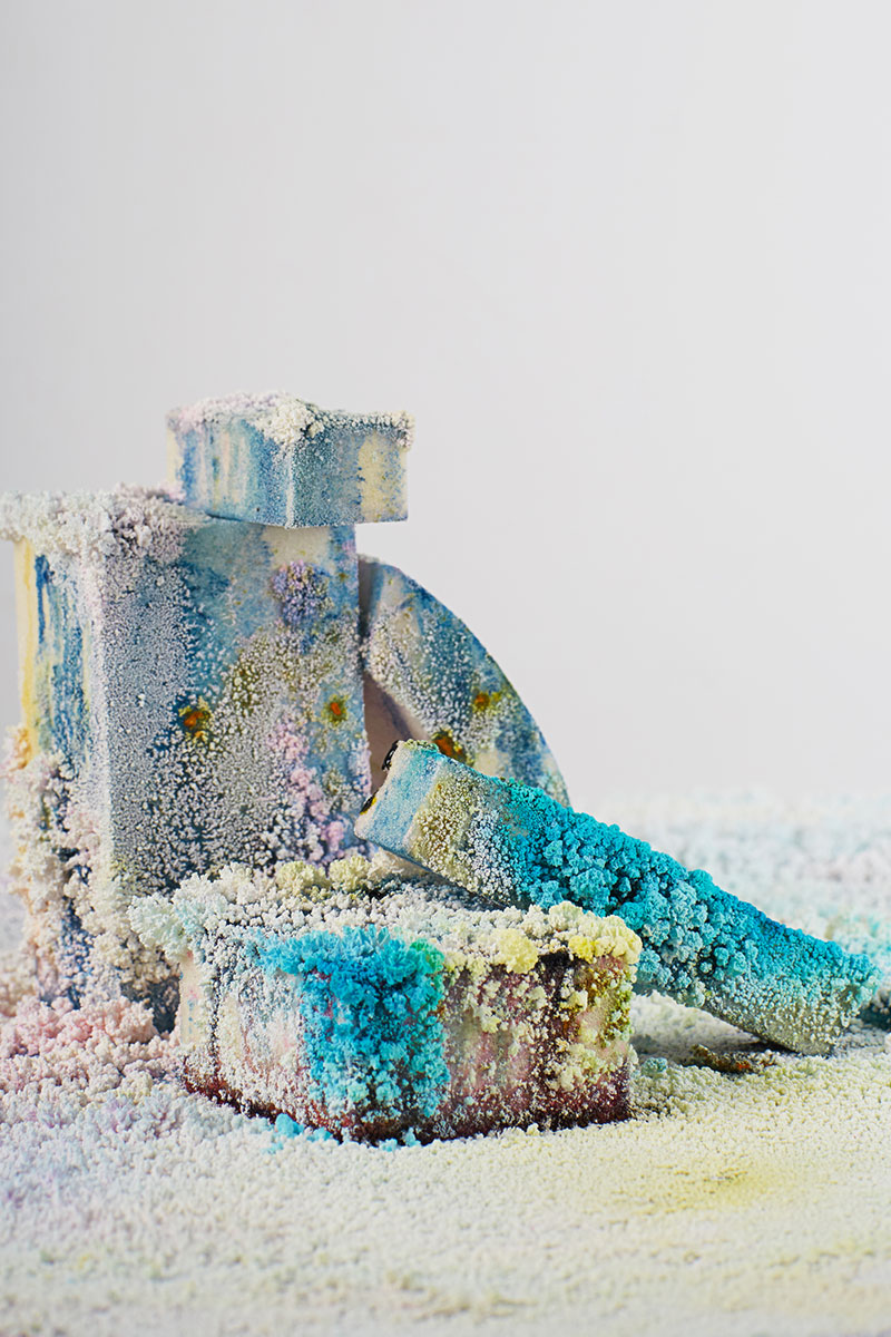
Yes, it’s equally important for me, because it’s all part of the same whole. In Money Makes Me Ugly/Mickey Makes Me Happy, my goal was to recycle the materials that had accumulated in my studio to create sculptures inspired by letter shapes. After making various sculptures, I decided that the shape should arise freely. The point of experimenting was therefore to create a piece without thinking about what would be the final product; to enhance intuition and spontaneity in the process of creation. In the identity I created for the 2017 Demo festival I broke the logo into pieces of foam to create an installation in which salt crystals would grow, and I took photographs to record this. It was the image of the festival and was exhibited in the gallery Dada Studios (Barcelona).
At EINA I was lucky enough to learn to understand typography both from its historical creation, to its malleability in society, its use, its personality… as well as finding that as a set of signs/symbols it can be “looked at” from many perspectives. I see typography as the union of image and text, creating an anachronistic form, working non-memory and spontaneity in graphic form.
In your project Money Makes Me Ugly/Mickey Makes Me Happy you reflect on imperfection. Could you tell us more about that?
For me, “taste” (the beautiful, what is liked) is a consensus in a determined period of time and place; I’m interested in getting out of the circle, as I said at the beginning of this interview, blurring those limits through experimentation, working openly on fiction vs. reality, the virtual vs. the physical, the true vs. the false, intuition vs. facts, designer vs. artist… Some of my typography work arises from these dichotomies, the graphics for the CCCB exhibition “After the End of the World,” the titles for the Alejandro Palomo documentary or the typography created for the Heroes logo for the Theatre Royal Stratford East in London…pushing to the limits of legibility and typography as an image.
It seems like the material that you choose (or find) sets the method you will follow. Is the medium the message?
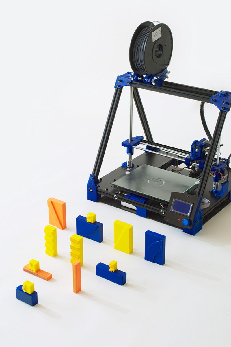
The medium is part of the message. For example, both the Money Makes Me sculptures and the series of vases exhibited at Axel Arigato (London, Gothenburg) are inspired by the photographic system used by Google Maps. If you first need to see a “vase” (a physical object) in order to be able to give it the name vase and obtain an image of it (a photograph of a vase); then in the first phase of the creation of this vase, the vase itself does not exist. The cycle begins with the photographic image as an object, as a virtual reality in itself. Thus, these vases/sculptures are constructed through their photography and not the physical piece itself. In the moment of their creation, they are given form, texture and colour through a series of mutations/decisions made from what was happening in the viewfinder of a camera. As in Google Street View, they are “images of a vase” that function as three-dimensional maps of vases. In fact, before taking the pieces of Money Makes Me out into the “real” world in the exhibition in Etage Projects, I passed them through Instagram filters to see what people would think. What was really interesting was seeing the titles that people posted attempting to decipher, catalogue, classify and understand what they were seeing. These pieces/things acquired a name via the perception of them in digital media.
For the brand identity of Demo in 2014, we experimented with movable type in 3D printing for a traditional printing system, a Heidelberg. For the graphics in 2015, we created an identity connected with the Internet of Things: momentary, flexible and customizable for the user. The logo, in the digital pieces for example, changed shape and colour according to the traffic and temperature in Barcelona that day, and the GPS location… The medium interacted not only with the message, but simultaneously with the recipient of the message.
Can you tell us about your upcoming projects?
A collection of suits with super powers. It’s a project about body/object, space/time, performance, design and narrative. It raises the possibility of a new kind of post-Anthropocene human who can easily redirect his force of change not on terrestrial ecosystems but towards his own inner nature. In this reconnection with the being, the body is diluted by dressing it with objects created under a mantra (faith) that pass to the person who carries them, experiencing the non-space and non-time of the object.
 Raquel Quevedo
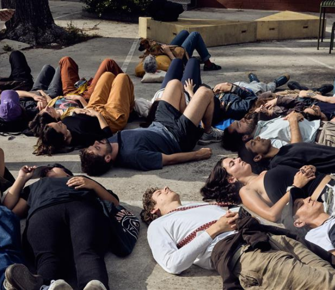
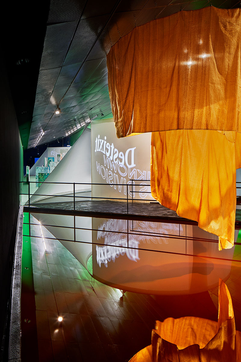
 Project by Raquel Quevedo
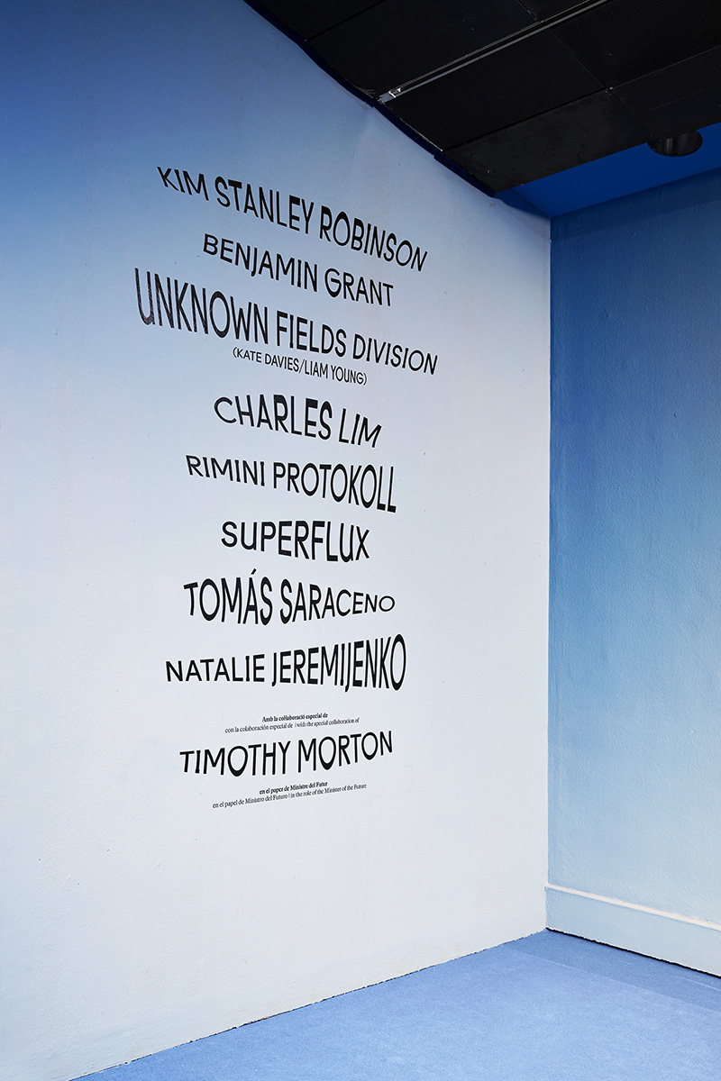
 Project by Raquel Quevedo
 Project by Raquel Quevedo
 Project by Raquel Quevedo
 Project by Raquel Quevedo
 Project by Raquel Quevedo